When I was a kid, I spent many summers (and some rainy breaks) camping in Oregon State Parks with my family. As a result, I learned so much about nature through the hands-on experience offered there – usually through programs like junior rangers, visitor centers and brochures. These all had one thing in common: how much visual storytelling was prioritized. It can be hard, especially for kids, to understand the complex science that makes up nature and the outdoor world. But when you approach it from a visual standpoint, it becomes a lot easier to distill and share that information to audiences with varying levels of education. That is why today we will be looking at some of the infographics created by state parks and how they promote accessibility through nature education.
What Makes Infographics Accessible?
At its base level, an infographic takes information that is often complex to understand and displays it in a way that the viewer can easily interpret and understand it. It allows people from various backgrounds, ages and education levels to learn something that wouldn’t have been easy to learn from a primary source (such as a dense research paper). But, depending on how it is designed and who is kept in mind during the design process, they aren’t always inclusive of those with visual or other disabilities. Below are a few examples of things that should be included in accessible design:
- Images should include alternate and descriptive text that describes the image
- Text display should be clear, easy to read and not include small or extravagant fonts
- Color contrast should fit within the Web AIM contrast accessibility guidelines
- Use titles, headings and paragraph sections that follow a logical order and are aligned in a consistent way
When these things are combined with the base goal of the infographic, it becomes a valuable tool to share information with countless people. We’re now going to take a look at how this comes to play with park and nature accessibility.
State Park Brochures and Signage
Below are a few examples of how the Oregon park system has taken these ideas and transformed them into infographics that convey the beauty and information of Pacific Northwest nature.


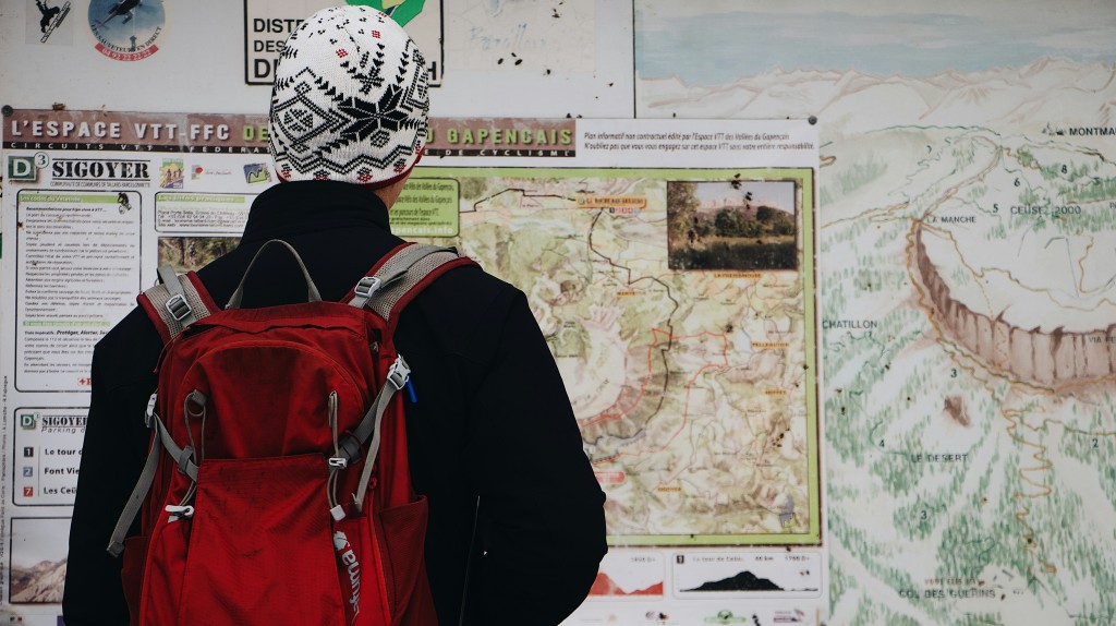
Color contrast is clear, fonts are easy to read and paragraphs are organized and portray information without relying entirely on imagery. Through these tools, visitors are able to do more than just view nature, they’re able to experience and understand it. Below is another example of how these come to life by being incorporated at on-site at locations. When they are tangible and physical, they also often include tactile or audio elements that allow visitors to engage with the information in different ways.


Without infographics like these, gaining knowledge, a crucial element to exploring the outdoors, would be lost. This type of visual storytelling is purely educational and aims to target audiences with a range of backgrounds but that have one thing in common – a love for nature. Incorporating things like this into the outdoor world not only shares knowledge, but communicates to the visitor that it is okay not to know everything. It’s welcoming, inviting and reassures them that this is a space for exploration regardless of your age and background.
